A gallery should prove the detail
Photography sites get this wrong all the time: they either serve every visitor a giant original, or they make the pictures so small that nobody can tell why the work matters. C-Well does neither.
The grid uses the right-sized WebP for the space on screen. Then, when someone wants to look closely, the lightbox lets them zoom into the real file. That is the point of this page: the detail is there when it matters, without making every page load pay for it.
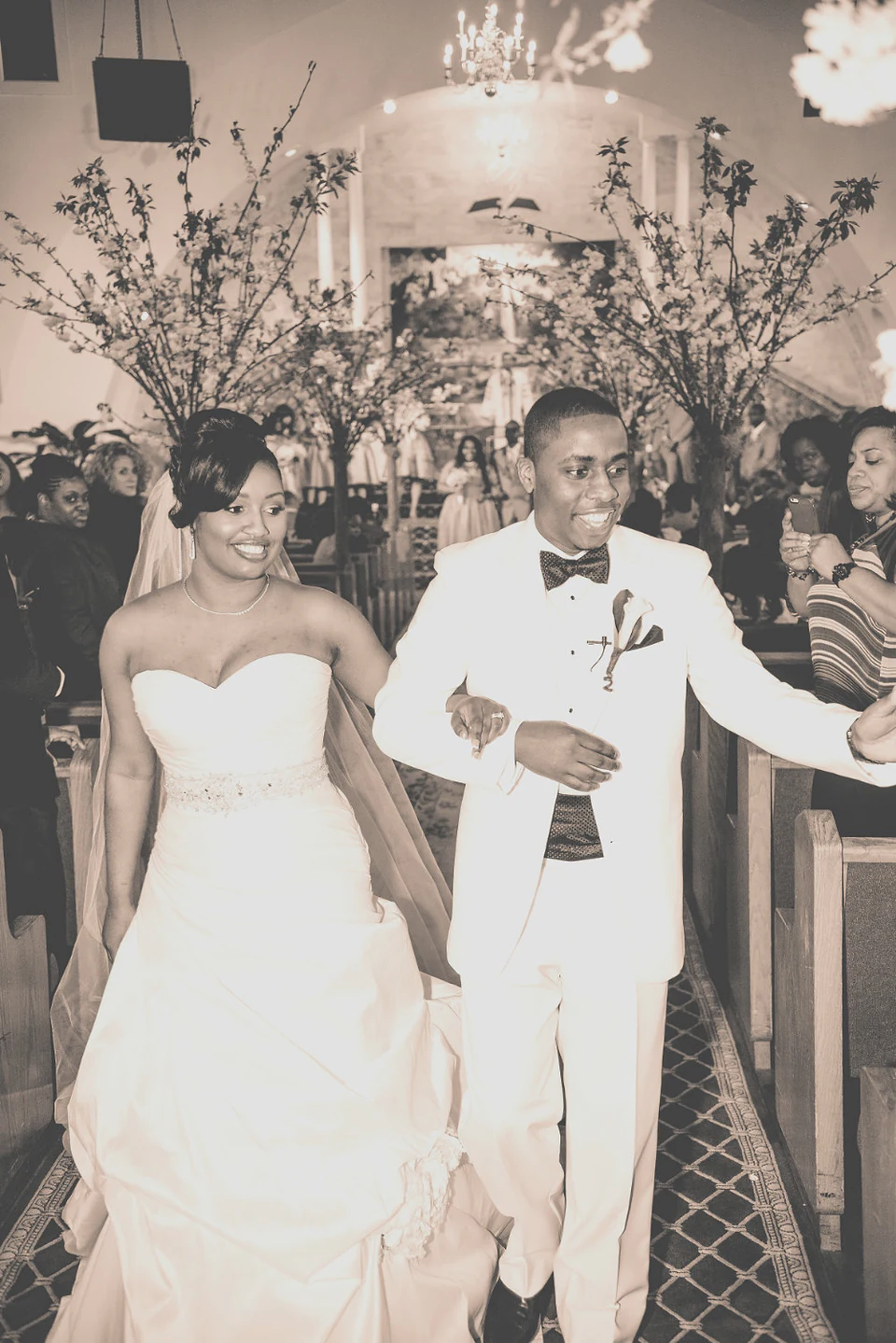
These are real C-Well files. Open one, then click it again to zoom. You can drag around a zoomed image, use the arrows to move through the set, or pinch on a phone. Resize the page and the browser will choose a different grid file for the new space.



Sharp without dragging the page down
For a sharp grid, serve an image a little larger than the box it fills, then let the browser scale it down:
<img srcset="photo-480.webp 480w, photo-960.webp 960w, photo-1600.webp 1600w"
     sizes="(max-width: 560px) 100vw, (max-width: 880px) 50vw, 400px" />
On a retina screen, a 400px box will usually choose the 960w file. That is enough detail to look clean without hauling down a 2200px original. sizes tells the browser the expected width of the slot before it renders, so it can make that choice early instead of guessing after the fact.
The part people miss: making responsive versions is not enough. Every image tag has to actually use srcset. We found thumbnails that were only 92×60px still downloading 2200px originals. The smaller files already existed; the page just was not using them. Creating derivatives and wiring them into the page are two separate jobs.
Notice that bridegroom stops at 960w. Its original is only 1001px wide, and the generator does not fake a bigger file by upscaling it. The gallery reads what was actually created instead of advertising a 1600w image that does not exist.
Keep the filenames boring and consistent:
photo-480.webp
photo-960.webp
photo-1600.webp
Not photo__w480.webp. One naming rule means the component, the generator, and the next person touching the site all know what to expect.
Let the photo keep its shape
The gallery uses CSS columns, not fixed-height boxes. Portraits stay tall, landscapes stay wide, and nobody has to crop the top of a head just to make a neat row:
.gallery-grid.is-masonry { display: block; columns: var(--cw-cols, 3); column-gap: 12px; }
.gallery-grid.is-masonry .gallery-cell { width: 100%; margin: 0 0 12px; break-inside: avoid; }
There is one tradeoff: the slick rearranging animation used by a fixed grid fights CSS columns. In masonry mode, a quiet cross-fade is the honest choice. The photos keep their proportions, which matters more.
Full source
GalleryGrid.svelte — the whole portfolio engine, including the PhotoSwipe lightbox, the category filter, and the "dive into a category without closing back to the grid" behaviour:
<script lang="ts">
// The Wakiro gallery engine — one component shared by /gallery and the
// homepage band, so a thumb opens the fullscreen lightbox IN PLACE (no page
// jump) and you can dive into a category without closing back to the grid.
// Ported from GalleryGrid.tsx; PhotoSwipe is vanilla JS, so no React shim.
import { onMount, onDestroy } from 'svelte';
import { flip } from 'svelte/animate';
import { scale, fly } from 'svelte/transition';
import { cubicOut } from 'svelte/easing';
import { prefersReducedMotion } from 'svelte/motion';
import { base } from '$app/paths';
import { srcset, slideSrcset, thumb, SIZES } from '$lib/img';
import { flag } from '$lib/copy.svelte';
import type { Still } from '$lib/content';
let {
items,
layout = 'masonry',
showFilter = true,
hoverStyle = 'reveal'
}: {
items: Still[];
layout?: 'masonry' | 'uniform';
showFilter?: boolean;
hoverStyle?: 'reveal' | 'minimal';
} = $props();
const src = (u: string) => `${base}${u}`;
// Set in Studio → Looks. Read at build time, so a latch flip becomes real
// behaviour on the next publish rather than a setting that does nothing.
// $derived, not const: the Studio can change these live in the preview
const COLUMNS = $derived(flag('flags.galleryRows', 3));
const LIGHTBOX = $derived(flag('flags.lightbox', true));
// <string> matters: without it the default narrows the type to the literal
// 'fade' and every comparison against 'rise'/'none' is a type error.
const REVEAL = $derived(flag<string>('flags.revealEffect', 'fade'));
// One place decides the entrance, so the markup stays readable and `scale`
// never gets handed a `y` it doesn't accept.
const DUR = () => (prefersReducedMotion.current || REVEAL === 'none' ? 0 : 400);
const revealIn = (node: Element) =>
REVEAL === 'rise'
? fly(node, { y: 14, duration: DUR(), easing: cubicOut })
: scale(node, { start: 0.97, duration: DUR(), easing: cubicOut });
const revealOut = (node: Element) =>
scale(node, { start: 0.97, duration: DUR() ? 250 : 0, easing: cubicOut });
// Images that fail to load are hidden from the grid AND the lightbox, and
// reported to the owner in the console — a visitor never sees a broken frame.
let broken = $state(new Set<string>());
const categories = $derived(['All', ...new Set(items.map((i) => i.category).filter(Boolean))] as string[]);
let active = $state('All');
const visible = $derived(
(active === 'All' ? items : items.filter((i) => i.category === active)).filter((i) => !broken.has(i.id))
);
$effect(() => {
if (broken.size === 0) return;
console.warn(
`[gallery] ${broken.size} broken image(s) hidden:`,
items.filter((i) => broken.has(i.id)).map((i) => ({ title: i.title, url: i.url }))
);
});
const ARROW_PREV = '<svg width="26" height="26" viewBox="0 0 24 24" fill="none" stroke="currentColor" stroke-width="2.4" stroke-linecap="round" stroke-linejoin="round" aria-hidden="true"><polyline points="14 6 9 12 14 18"></polyline></svg>';
const ARROW_NEXT = '<svg width="26" height="26" viewBox="0 0 24 24" fill="none" stroke="currentColor" stroke-width="2.4" stroke-linecap="round" stroke-linejoin="round" aria-hidden="true"><polyline points="10 6 15 12 10 18"></polyline></svg>';
type LB = { pswp: any; loadAndOpen: (i: number, d: unknown[]) => void; destroy: () => void; on: (e: string, f: () => void) => void; init: () => void };
let lb: LB | null = null;
let filterCat = 'All';
let lastIndex = 0;
let drawStrip: () => void = () => {};
// srcset: the slide opens as a viewport-sized webp and only zoom fetches the
// original — before this, every slide (and its preloaded neighbours) paid the
// full 2200px price on open. msrc: the grid thumb the browser already holds,
// so the lightbox opens on a warm image instead of a blank frame.
const slides = () =>
items.map((i) => ({
src: src(i.url), srcset: slideSrcset(i.url, i.width), msrc: thumb(i.url),
width: i.width, height: i.height, alt: i.alt,
cat: i.category || '', pid: i.id, title: i.title
}));
// Switch category IN PLACE — refilter the strip and jump to the first match,
// never close back to the grid. This is the "dive in" behavior.
function dive(cat: string) {
const pswp = lb?.pswp;
if (!pswp) return;
filterCat = cat;
if (cat !== 'All' && items[pswp.currIndex]?.category !== cat) {
const j = items.findIndex((i) => i.category === cat);
if (j >= 0) { lastIndex = j; pswp.goTo(j); }
}
drawStrip();
}
function openAt(id: string) {
if (!LIGHTBOX) return; // Looks → Lightbox off
const idx = Math.max(0, items.findIndex((i) => i.id === id));
filterCat = active;
lastIndex = idx;
lb?.loadAndOpen(idx, slides());
}
onMount(async () => {
// dynamic import keeps PhotoSwipe out of the initial bundle — the grid
// paints without it and it loads before the first thumb can be clicked
const [{ default: PhotoSwipeLightbox }] = await Promise.all([
import('photoswipe/lightbox'),
import('photoswipe/style.css')
]);
const lightbox = new PhotoSwipeLightbox({
pswpModule: () => import('photoswipe'),
bgOpacity: 1,
arrowPrevSVG: ARROW_PREV,
arrowNextSVG: ARROW_NEXT,
paddingFn: () => ({ top: 56, bottom: 138, left: 48, right: 48 })
}) as unknown as LB;
lb = lightbox;
lightbox.on('uiRegister', () => {
const pswp = lightbox.pswp;
if (!pswp) return;
// caption + the one quiet category name
pswp.ui?.registerElement({
name: 'cwell-bottom', order: 9, isButton: false, appendTo: 'root',
onInit: (el: HTMLElement) => {
el.className = 'pswp__cwell-bottom';
const chevR = `<svg class="pswp__cwell-chev" width="13" height="13" viewBox="0 0 24 24" fill="none" stroke="currentColor" stroke-width="2.4" stroke-linecap="round" stroke-linejoin="round"><polyline points="10 6 15 12 10 18"></polyline></svg>`;
const chevL = `<svg class="pswp__cwell-chev" width="13" height="13" viewBox="0 0 24 24" fill="none" stroke="currentColor" stroke-width="2.4" stroke-linecap="round" stroke-linejoin="round"><polyline points="14 6 9 12 14 18"></polyline></svg>`;
const esc = (s: string) => s.replace(/[<>&"]/g, (c) => ({ '<': '<', '>': '>', '&': '&', '"': '"' })[c]!);
const render = () => {
const d = pswp.currSlide?.data;
const cap = d?.title ? `<span class="pswp__cwell-cap">${esc(d.title)}</span>` : '';
const tag = filterCat !== 'All'
? `<button class="pswp__cwell-tag is-back" data-cat="All">${chevL}All</button>`
: d?.cat ? `<button class="pswp__cwell-tag" data-cat="${esc(d.cat)}">${esc(d.cat)}${chevR}</button>` : '';
el.innerHTML = cap + (cap && tag ? `<span class="pswp__cwell-sep">·</span>` : '') + tag;
const btn = el.querySelector<HTMLButtonElement>('.pswp__cwell-tag');
if (btn) btn.onclick = () => dive(btn.dataset.cat || 'All');
};
render();
pswp.on('change', render);
}
});
// bottom thumbnail filmstrip — follows the category, click to jump
pswp.ui?.registerElement({
name: 'cwell-strip', order: 8, isButton: false, appendTo: 'root',
onInit: (el: HTMLElement) => {
el.className = 'pswp__strip';
const draw = () => {
const list = filterCat === 'All' ? items : items.filter((i) => i.category === filterCat);
const curId = pswp.currSlide?.data?.pid;
el.innerHTML = list
.map((i) => `<button class="pswp__thumb${i.id === curId ? ' is-on' : ''}" data-id="${i.id}"><img src="${thumb(i.url)}" alt="" loading="lazy"></button>`)
.join('');
el.querySelectorAll<HTMLButtonElement>('.pswp__thumb').forEach((b) => {
b.onclick = () => {
const idx = items.findIndex((i) => i.id === b.dataset.id);
if (idx >= 0) pswp.goTo(idx);
};
});
(el.querySelector('.pswp__thumb.is-on') as HTMLElement | null)?.scrollIntoView({ inline: 'center', block: 'nearest', behavior: 'smooth' });
};
drawStrip = draw;
draw();
pswp.on('change', draw);
}
});
});
// keep next/prev inside the active category (dataSource is everything)
lightbox.on('change', () => {
const pswp = lightbox.pswp;
if (!pswp) return;
const i = pswp.currIndex;
if (filterCat !== 'All' && items[i] && items[i].category !== filterCat) {
const dir = i >= lastIndex ? 1 : -1;
let j = i;
for (let k = 0; k < items.length; k++) {
j = (j + dir + items.length) % items.length;
if (items[j].category === filterCat) break;
}
lastIndex = j;
pswp.goTo(j);
return;
}
lastIndex = i;
});
lightbox.init();
});
// NOT returned from onMount: that callback is async here, and Svelte only
// treats a synchronously-returned function as the teardown.
onDestroy(() => { lb?.destroy(); lb = null; });
</script>
{#if showFilter && categories.length > 1}
<div class="gallery-filter">
{#each categories as c (c)}
<button class="gallery-filter-btn{active === c ? ' is-active' : ''}" onclick={() => (active = c)}>{c}</button>
{/each}
</div>
{/if}
<div style={`--cw-cols:${COLUMNS}`} class="gallery-grid {layout === 'masonry' ? 'is-masonry' : 'is-uniform'} hover-{hoverStyle}">
{#each visible as item (item.id)}
<!-- Svelte does natively what the React version needed Motion for:
`animate:flip` tweens survivors to their new slots when the filter
changes, and in/out handle the ones entering and leaving. FLIP is
applied only in uniform mode — it animates `transform`, which fights
CSS multi-column flow, so masonry cross-fades instead (the React
version disabled its layout animation for masonry for the same
reason). `prefersReducedMotion` is a reactive rune, so this respects
the OS setting live rather than at first render. -->
<button
class="gallery-cell"
onclick={() => openAt(item.id)}
aria-label={`Open ${item.title || 'photo'}`}
animate:flip={{ duration: prefersReducedMotion.current || layout === 'masonry' ? 0 : 380, easing: cubicOut }}
in:revealIn
out:revealOut
>
<img
src={src(item.url)}
srcset={srcset(item.url)}
sizes={SIZES.masonry}
alt={item.alt}
width={item.width}
height={item.height}
loading="lazy"
decoding="async"
style={item.focal ? `object-position:${item.focal}` : undefined}
onerror={() => { if (!broken.has(item.id)) broken = new Set(broken).add(item.id); }}
/>
{#if item.title && hoverStyle === 'reveal'}
<span class="gallery-cell-title">{item.title}</span>
{/if}
</button>
{/each}
</div>
<style>
/* Ported verbatim from gallery.css — grid + filter. */
.gallery-filter { display: flex; flex-wrap: wrap; gap: 4px 6px; margin-bottom: 32px; max-width: 100%; overflow-x: auto; overscroll-behavior-x: contain; }
.gallery-filter-btn {
flex: 0 0 auto; border: none; background: none; cursor: pointer;
font-family: var(--font-poppins), sans-serif; font-size: .82rem; color: var(--muted);
padding: 6px 12px; min-height: 44px; border-radius: 6px; white-space: nowrap;
transition: color .2s ease, background .2s ease;
}
.gallery-filter-btn:hover { color: var(--dark); }
.gallery-filter-btn.is-active { color: var(--inv); background: var(--terra); }
.gallery-grid { display: grid; grid-template-columns: repeat(auto-fill, minmax(260px, 1fr)); gap: 12px; }
/* TRUE masonry — CSS columns, each photo at its NATURAL height (full frame,
never cropped), 3 per row: portraits tall, landscapes wide. */
.gallery-grid.is-masonry { display: block; columns: var(--cw-cols, 3); column-gap: 12px; }
@media (max-width: 880px) { .gallery-grid.is-masonry { columns: 2; } }
@media (max-width: 560px) { .gallery-grid.is-masonry { columns: 1; } }
.gallery-grid.is-masonry .gallery-cell { width: 100%; margin: 0 0 12px; break-inside: avoid; }
.gallery-grid.is-masonry .gallery-cell img { height: auto; }
.gallery-grid.is-uniform .gallery-cell { aspect-ratio: 4 / 3; }
.gallery-cell {
position: relative; display: block; padding: 0; border: none; cursor: pointer;
background: var(--bg2); border-radius: 8px; overflow: hidden; text-decoration: none;
}
.gallery-cell img { width: 100%; height: 100%; object-fit: cover; transition: transform .6s var(--ease-word), filter .3s ease; }
.gallery-grid.hover-reveal .gallery-cell:hover img { transform: scale(1.04); }
.gallery-cell-title {
position: absolute; left: 0; right: 0; bottom: 0; padding: 28px 16px 14px;
font-size: .8rem; font-weight: 500; color: #fff; text-align: left;
background: linear-gradient(to top, rgba(0,0,0,.55), transparent);
opacity: 0; transition: opacity .25s ease;
}
.gallery-cell:hover .gallery-cell-title { opacity: 1; }
/* lightbox off: the tile isn't pretending to be clickable */
.gallery-cell.is-static { cursor: default; }
@media (prefers-reduced-motion: reduce) {
.gallery-cell img, .gallery-grid.hover-reveal .gallery-cell:hover img { transition: none; transform: none; }
}
</style>
The generator that produces the derivative files, scripts/derivatives.mjs, walks every original in static/media, builds each rung with sharp, and never upscales:
// Build responsive derivatives once, into static/media/r/.
//
// The originals are 2200px JPEGs — sending those to a phone was the site's
// biggest remaining weakness. This emits 480/960/1600 WebP next to them and the
// pages reference them with srcset/sizes, so a phone fetches ~40KB instead of
// ~1MB and the browser picks the right one.
//
// Idempotent: a derivative that already exists and is newer than its source is
// skipped, so re-running is cheap. Run: npm run images
import { readdir, mkdir, stat, writeFile } from 'node:fs/promises';
import { existsSync } from 'node:fs';
import path from 'node:path';
import sharp from 'sharp';

const SRC = 'static/media';
const OUT = path.join(SRC, 'r');
// 2200 matters for the lightbox: a slide slot on a DPR-2 screen computes to
// ~2000 device pixels, and with no rung up there the browser climbs past 1600
// straight to the JPG original — 722KB where a webp of the SAME pixels is ~300.
const WIDTHS = [480, 960, 1600, 2200];

await mkdir(OUT, { recursive: true });
const files = (await readdir(SRC)).filter((f) => /\.(jpe?g|png)$/i.test(f));

// Which widths actually got written, per image. srcset() reads this instead of
// assuming — the hero advertised a 1600w file that was correctly never built
// (the source was 1554px wide) and the browser fetched a 404.
const manifest = {};
let made = 0, skipped = 0, failed = 0, ceilinged = 0;
for (const file of files) {
	const srcPath = path.join(SRC, file);
	const srcStat = await stat(srcPath);
	const stem = file.replace(/\.[^.]+$/, '');
	let meta;
	try {
		meta = await sharp(srcPath).metadata();
	} catch (e) {
		console.warn(`  ! unreadable, skipping: ${file} (${e.message})`);
		failed++;
		continue;
	}
	manifest[stem] = { r: [], n: meta.width ?? 0 };
	// The ladder always TOPS OUT in webp: alongside the fixed rungs, emit one at
	// the original's own width (capped at 2200). Without it, any original that
	// lands between rungs — a 2048px file, say — keeps its JPG as the sharpest
	// option, and a DPR-2 lightbox slide dutifully fetches the heaviest format
	// on the page. With it, the JPG is never the best answer and never fetched.
	const rungs = [...new Set([...WIDTHS, Math.min(meta.width ?? 0, 2200)])].sort((a, b) => a - b);
	for (const w of rungs) {
		// never upscale — a 900px original has no business being served at 1600
		if (!w || (meta.width && meta.width < w)) continue;
		const outPath = path.join(OUT, `${stem}-${w}.webp`);
		if (existsSync(outPath) && (await stat(outPath)).mtimeMs > srcStat.mtimeMs) { manifest[stem].r.push(w); skipped++; continue; }
		const buf = await sharp(srcPath)
			.rotate() // honour EXIF orientation, or portraits come out sideways
			.resize({ width: w, withoutEnlargement: true })
			// Bunny's optimizer strips ICC on WebP and washes colour out; baking
			// sRGB in here keeps skin tones right wherever these are served from.
			.toColorspace('srgb')
			// Output sharpening, same as for print: downscaling softens, a whisper
			// of unsharp after the resize restores the edge without halos.
			.sharpen({ sigma: 0.5 })
			// Two quality tiers, both set by KC's eye, not a benchmark:
			//   ≤960 (grid thumbs, judged at 400px)  q88 — q78 banded the blue-room
			//        seamless into stepped contours and smeared red chroma edges.
			//   >960 (lightbox, judged like a print)  q95 — at q88 the fine curl
			//        highlights in light-adjustments visibly smoothed away against
			//        the source; q95 holds them. Costs ~2x the bytes on the large
			//        rungs only, and those replaced JPGs twice their size anyway.
			// smartSubsample throughout: lossy webp halves colour resolution, and
			// half this portfolio lives in its chroma (red silhouettes, purple
			// seamless). AVIF 4:4:4 does the q95 job at a third the bytes — noted
			// for a <picture> refinement; srcset alone has no format fallback.
			.webp({ quality: w > 960 ? 95 : 88, effort: 6, smartSubsample: true })
			.toBuffer();
		// The byte ceiling: a rung never outweighs the source. If the re-encode
		// is bigger than the file it came from, it is not written and not listed —
		// the ladders then top out with the ORIGINAL, which is both the quality
		// ceiling and, in this case, the cheaper file. Quality ceiling = source,
		// byte ceiling = source, always the cheaper of the two.
		if (buf.length >= srcStat.size) { ceilinged++; continue; }
		await writeFile(outPath, buf);
		manifest[stem].r.push(w);
		made++;
	}
}
await writeFile('src/lib/derivatives.json', JSON.stringify(manifest, null, 0) + '\n');
console.log(`derivatives: ${made} written, ${skipped} up-to-date, ${ceilinged} hit the byte ceiling (original serves instead), ${failed} unreadable, from ${files.length} originals`);